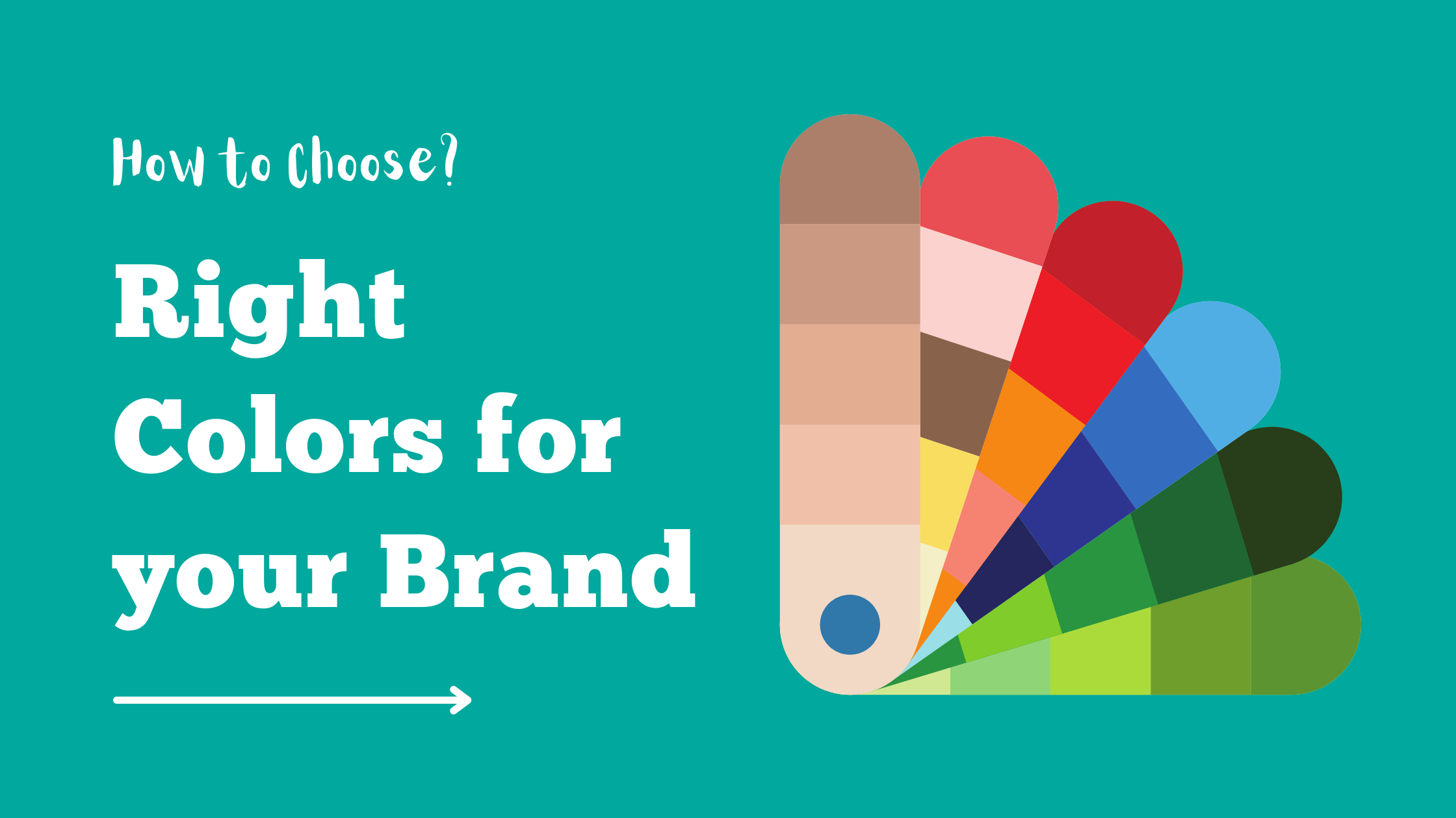
Creating a strong brand identity is crucial for any business’s success. One of the fundamental elements of a brand’s identity is its color palette. Colors have a profound impact on human psychology and can evoke specific emotions and associations. When chosen thoughtfully, colors can help convey your brand’s values, personality, and message. In this article, we’ll explore the process of selecting the right colors for your brand identity, supported by research and practical insights.
The Psychology of Colors
Before delving into the selection process, it’s important to understand the psychological associations that different colors can evoke:
- Red: Associated with energy, passion, and excitement. It can also evoke a sense of urgency.
- Blue: Often linked to trust, reliability, and calmness. Lighter shades can appear more friendly, while darker shades may convey professionalism.
- Green: Represents growth, health, and nature. It’s commonly associated with eco-friendly and sustainable brands.
- Yellow: Radiates positivity, warmth, and optimism. However, it’s essential to use it moderately, as excessive yellow can be overwhelming.
- Orange: Combines the energy of red with the friendliness of yellow. It’s often used to create a sense of enthusiasm.
- Purple: Signifies luxury, creativity, and elegance. Lighter shades can evoke a softer, more feminine vibe.
- Black: Symbolizes sophistication, authority, and strength. It’s commonly used by high-end brands.
- White: Represents purity, simplicity, and cleanliness. It can also create a sense of space.
Steps to Choosing Your Brand Colors
- Understand Your Brand: Start by defining your brand’s values, mission, and personality. Are you aiming for a playful and energetic brand, or do you want to project professionalism and reliability?
- Identify Your Target Audience: Research your target audience’s preferences and cultural associations with colors. Different cultures perceive colors differently, so consider international audiences if applicable.
- Competitor Analysis: Research your competitors’ color choices. While you don’t want to copy them, understanding the color landscape within your industry can help you differentiate your brand.
- Color Wheel Basics: Familiarize yourself with the color wheel. Complementary colors (opposite each other on the wheel) create contrast, while analogous colors (adjacent on the wheel) provide harmony.
- Limit Your Palette: While it might be tempting to use a wide range of colors, it’s advisable to stick to a primary palette of 2-4 colors. Too many colors can confuse your audience.
- Test for Accessibility: Ensure that the colors you choose are accessible to all users, including those with visual impairments. Tools like color contrast checkers can help you determine if your color combinations meet accessibility standards.
- Use Emotional Resonance: Leverage the psychology of colors to evoke specific emotions in your audience. For example, if your brand is focused on relaxation and wellness, calming blues and soft greens could be suitable.
Incorporating Images in Your Branding
Images are powerful tools to enhance your brand’s visual identity. They can reinforce the emotions and messages your brand wants to convey. Here’s how to effectively use images:
- Consistency: Maintain a consistent style for your images. Whether it’s the subject matter, color tone, or style, consistency helps build a recognizable brand.
- Reflect Your Values: Choose images that align with your brand’s values and messaging. If you promote sustainability, include images of nature or eco-friendly practices.
- Showcase Products and Services: If applicable, showcase your products or services in action. High-quality images that highlight the benefits can resonate with potential customers.
- Tell a Story: Use images to tell a narrative about your brand’s journey, values, or customers. People connect more deeply with stories than with blatant promotions.
Research-Backed Insights
Research supports the idea that color plays a significant role in brand recognition and customer perception:
- A study titled “The Impact of Color on Marketing” by Satyendra Singh found that up to 60-90% of snap judgments about products are influenced by color alone.
- The “Interactive Effects of Colors” study published in the Journal of Business Research revealed that the combination of colors used in branding significantly impacts consumers’ perceptions of a brand’s personality.
- A research article in the journal “Management Decision” titled “Colour and Product Choice” concluded that color can influence a consumer’s decision to purchase, with different colors evoking distinct responses.
1. Coca-Cola: The Power of Tradition and Boldness
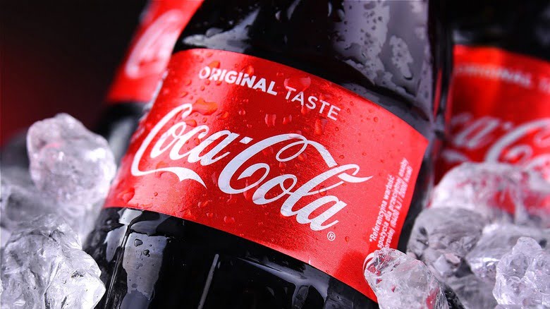
Coca-Cola’s brand identity is synonymous with its iconic red color. The company’s choice of red goes beyond aesthetics—it’s a representation of energy, excitement, and passion. Red is known to stimulate appetite and catch attention, making it a perfect fit for a beverage company. Coca-Cola’s use of red across its packaging, advertisements, and even its logo has created a strong and easily recognizable brand presence worldwide.
Lesson: Embrace a color that not only aligns with your brand’s values but also stands out in your industry.
2. Apple: Minimalism and Sophistication
Apple’s brand identity is characterized by sleek, minimalist design and a clean white color. The white color reflects simplicity, purity, and innovation. It creates a sense of approachability, making technology less intimidating for consumers. Additionally, the silver used in their hardware signifies modernity and sophistication. Apple’s consistent use of white and silver across its products and marketing materials has contributed to its premium and cutting-edge image.
Lesson: Consider how your color choices can reflect the qualities you want your brand to be associated with, such as simplicity or innovation.
3. Starbucks: Warmth and Connection

Starbucks, known for its global presence and inviting atmosphere, incorporates a rich green color into its brand identity. The green color symbolizes growth, freshness, and harmony with nature. This choice aligns with the company’s commitment to sustainable and ethical sourcing. Moreover, the warm, earthy tones used in their stores and packaging create a cozy and welcoming environment that encourages customers to linger.
Lesson: Connect your brand colors with your values and create an environment that resonates with your target audience.
4. FedEx: Trust and Reliability

FedEx’s brand identity revolves around its distinctive purple and orange color combination. The bold purple represents reliability, professionalism, and trustworthiness. Paired with the energetic orange, it creates a sense of urgency and dynamism, aligning with FedEx’s efficient delivery services. This unique pairing helps the brand stand out in the competitive logistics industry.
Lesson: Experiment with color combinations that can convey a blend of qualities that define your brand.
5. McDonald’s: Fun and Appetizing

McDonald’s has mastered the art of using red and yellow to evoke emotions that align perfectly with its fast-food brand. The vibrant red stimulates appetite and excitement, while the cheerful yellow radiates positivity and energy. These colors are particularly effective for a brand that wants to attract families and create a sense of fun.
Lesson: Think about the emotional responses different colors can trigger and choose ones that resonate with your target audience.
6. Airbnb: Community and Diversity
Airbnb’s brand identity showcases a combination of pastel colors, including soft pink, teal, and deep blue. These colors convey a sense of diversity, inclusivity, and warmth. The unique approach to colors aligns with Airbnb’s focus on connecting travelers with local communities and providing a personal and authentic experience.
Lesson: Don’t be afraid to break away from industry norms and experiment with colors that uniquely represent your brand’s values.
7. Nike: Empowerment and Energy

Nike’s iconic “swoosh” logo is instantly recognizable, and the choice of black and white enhances its impact. The simplicity of black and white reflects clarity, sophistication, and versatility. These colors allow Nike to showcase its products and the athletes it sponsors without distraction, reinforcing the brand’s association with performance and empowerment.
Lesson: Consider how the simplicity of black and white can create a versatile and powerful brand presence.
Incorporating images effectively is equally important in these examples. Coca-Cola’s joyful ads featuring people enjoying their beverages, Apple’s clean product imagery, Starbucks’ cozy coffee shop ambiance—each company uses images that complement their brand colors and values.
Conclusion
Selecting the right colors for your brand identity is a strategic process that requires a deep understanding of your brand’s values, target audience, and the psychology of colors. By following these steps and incorporating research-backed insights, you can create a compelling brand identity that resonates with your audience and communicates your brand’s essence effectively. Remember, every color choice you make contributes to the story you’re telling about your brand.