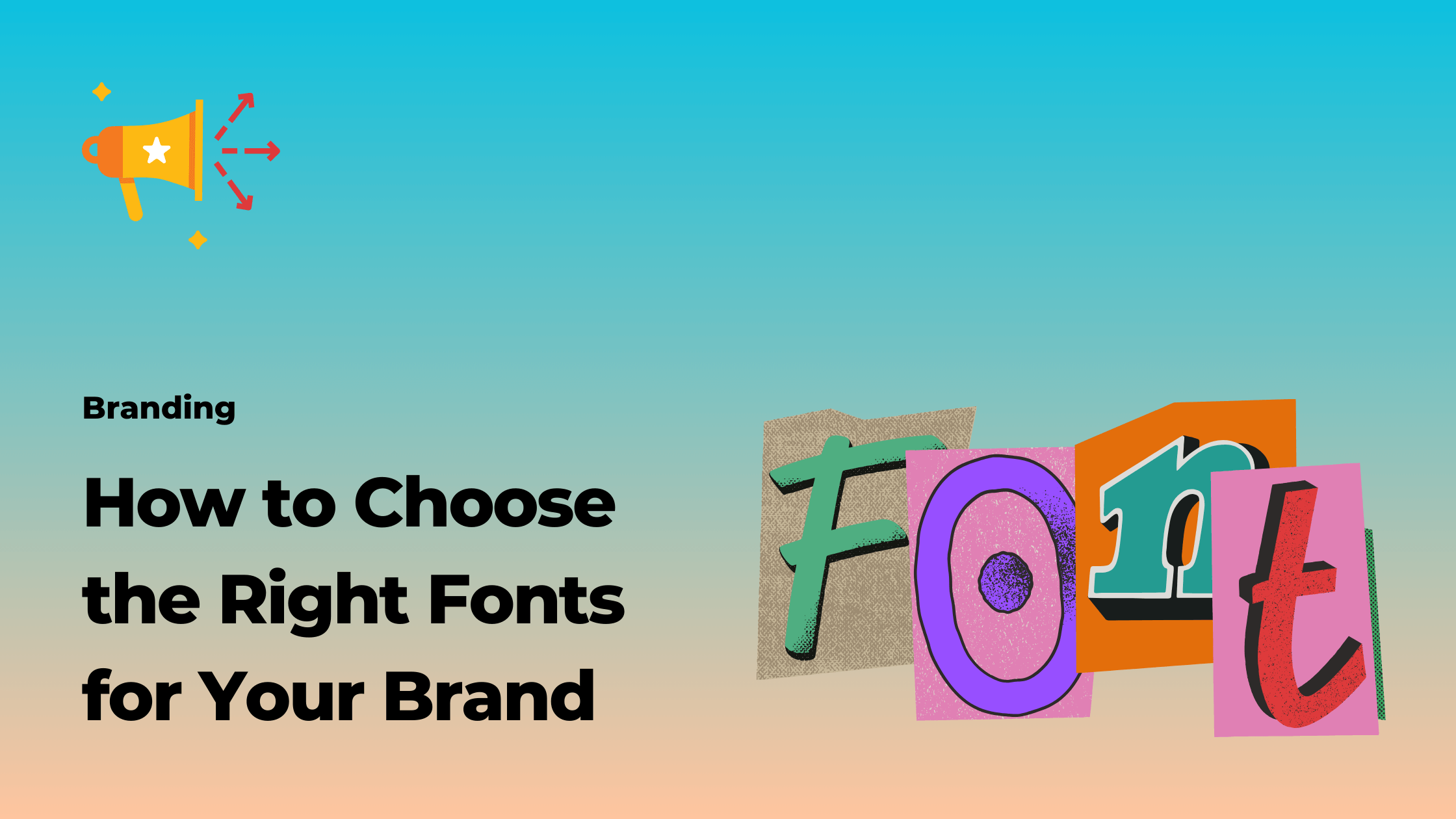
In today’s digital age, branding has become more important than ever. With countless companies vying for attention, establishing a strong brand identity is crucial for success. While many factors contribute to a brand’s image, typography plays a significant role in conveying its personality and values. The fonts you choose for your brand can evoke emotions, communicate messages, and leave a lasting impression on your audience. In this article, we will explore the importance of typography in branding and provide valuable insights on how to choose the right fonts for your brand identity.
Table of Contents
The Importance of Typography in Branding
Typography is not just about selecting visually appealing fonts; it goes beyond aesthetics. The fonts you choose have the power to shape your brand’s perception and connect with your target audience on a deeper level. Typography acts as a visual language that communicates your brand’s personality, values, and tone. It sets the tone for your brand’s message and influences how consumers perceive your products or services.
Effective typography can make your brand stand out from the competition and create a cohesive visual identity. Consistency in font usage across various brand assets such as logos, websites, packaging, and marketing materials helps build recognition and fosters brand loyalty. By carefully selecting the right fonts, you can establish a unique brand voice and differentiate yourself in the market.
How Fonts Can Convey Brand Personality
Every font has its own personality, just like people do. Some fonts are bold and assertive, while others are elegant and refined. The choice of fonts should align with your brand’s personality and the emotions you want to evoke in your target audience. For example, a luxury brand might opt for serif fonts with intricate details to convey sophistication and exclusivity. On the other hand, a tech startup aiming for a modern and innovative image might choose clean and minimalist sans-serif fonts.
Consider the emotions you want to evoke and the values you want to associate with your brand. Fonts with rounded edges might create a friendly and approachable feel, while sharp and angular fonts can convey a sense of strength and authority. By understanding the nuances of different font styles, you can make informed decisions that align with your brand’s identity and resonate with your audience.
Factors to Consider When Choosing Fonts for Your Brand
When choosing fonts for your brand, it’s essential to consider various factors to ensure they effectively convey your brand’s message. Here are some key factors to consider:
1. Legibility and Readability
No matter how visually appealing a font may be, it must be legible and readable. Fonts that are difficult to read can frustrate your audience and diminish the impact of your brand message. Consider the font’s letterforms, spacing, and size to ensure optimal legibility across different platforms and devices.
2. Brand Consistency
Consistency is key in branding, and typography is no exception. Consistent font usage across different brand assets creates a unified and cohesive visual identity. Choose fonts that work well together and maintain consistency across all touchpoints to reinforce your brand’s image and enhance recognition.
3. Versatility
Consider the versatility of the fonts you choose. Are they suitable for various applications and mediums? Fonts that are adaptable to different contexts and sizes offer more flexibility in your brand’s visual communication. Ensure your chosen fonts can be easily scaled, both in print and digital formats, without losing their quality and legibility.
4. Target Audience
Your target audience should influence your font choices. Consider their demographics, preferences, and cultural background. Fonts that resonate with your target audience can create a stronger emotional connection and enhance the overall brand experience.
Understanding Font Categories and Styles
To make informed font choices, it’s crucial to understand the different font categories and styles available. Fonts can generally be classified into four main categories:
1. Serif Fonts
Serif fonts have small decorative strokes, or serifs, at the ends of the letterforms. They are often associated with tradition, elegance, and sophistication. Serif fonts are commonly used in print materials, luxury brands, and formal contexts.
2. Sans-Serif Fonts
Sans-serif fonts, as the name suggests, do not have serifs. They are known for their clean, simple, and modern appearance. Sans-serif fonts are widely used in digital platforms, technology brands, and contemporary designs.
3. Script Fonts
Script fonts mimic handwriting and have a more decorative and playful feel. They are often used to convey elegance, creativity, and a personal touch. Script fonts are commonly seen in luxury brands, wedding invitations, and artistic designs.
4. Display Fonts
Display fonts are highly stylized and often used for headlines, logos, and attention-grabbing purposes. They come in various styles, such as grunge, retro, or futuristic. Display fonts are suitable for brands that want to make a bold statement and stand out from the crowd.
By familiarizing yourself with the different font categories and styles, you can narrow down your font choices and select the ones that best represent your brand’s personality and values.
How to Choose a Font That Aligns With Your Brand Values
Choosing the right fonts for your brand is a process that requires careful consideration. To ensure your font choices align with your brand values, follow these steps:
1. Define Your Brand’s Personality
Start by clearly defining your brand’s personality and values. Is your brand playful and youthful, or sophisticated and professional? Understanding your brand’s personality will guide you in selecting fonts that accurately reflect these traits.
2. Research Font Associations
Research the associations and emotions commonly associated with different font styles. Look for fonts that align with your brand’s desired associations and evoke the desired emotions in your target audience.
3. Test Fonts Across Different Media
Before finalizing your font choices, test them across various media and platforms. Ensure they remain legible and visually appealing in different sizes, resolutions, and contexts.
4. Seek Professional Advice
If you’re unsure about your font choices or want expert guidance, consider consulting a professional designer or branding agency. They can provide valuable insights and help you make informed decisions that align with your brand’s values and objectives.
Tips for Finding the Right Font for Your Brand
Finding the perfect font for your brand can sometimes be a daunting task. However, with these tips, you can simplify the process and find the right font that resonates with your brand identity:
1. Start with Typography Mood Boards
Create typography mood boards to gather inspiration and visualize how different fonts work together. Collect examples of fonts that align with your brand personality and desired aesthetics. This exercise will help you identify patterns and narrow down your font choices.
2. Consider Font Pairings
Fonts are rarely used in isolation. Consider how different fonts can complement each other and create a harmonious visual hierarchy. Pairing a bold headline font with a more subtle body font can create a balanced and visually appealing composition.
3. Don’t Overcomplicate
While it’s essential to choose fonts that reflect your brand’s personality, it’s equally important not to overcomplicate your font selection. Avoid using too many fonts, as it can create visual clutter and dilute your brand’s identity. Stick to a few well-chosen fonts that work well together and maintain consistency across your brand assets.
4. Test Before Implementation
Before implementing your chosen fonts across your brand assets, test them thoroughly. Print samples, create digital mock-ups, and gather feedback from stakeholders or focus groups. Testing will help you identify any readability or legibility issues and make necessary adjustments before finalizing your font choices.
The Impact of Typography on Brand Recognition
Consistency in typography plays a crucial role in brand recognition. When your audience consistently sees the same fonts across your brand assets, they begin to associate those fonts with your brand. Over time, these fonts become synonymous with your brand identity, making them instantly recognizable.
Typography acts as a visual cue that triggers brand recall and reinforces the connection between your brand and your audience. By consistently using your chosen fonts across your marketing materials, packaging, websites, and social media platforms, you establish a strong visual identity that sets your brand apart from competitors.
The Role of Consistency in Font Usage
Consistency is a fundamental principle in branding, and font usage is no exception. Consistent use of fonts across different brand assets creates a cohesive and unified visual identity. When your audience encounters consistent fonts, they experience a sense of familiarity and trust, strengthening their connection with your brand.
Consistency in font usage also helps streamline your brand’s communication. By establishing a set of brand guidelines and ensuring all stakeholders adhere to them, you can maintain consistency in font choices, sizes, and spacing. This consistency enhances brand recognition and ensures a seamless and cohesive brand experience for your audience.
The Ideal Number of Fonts for a Brand
While there is no fixed rule for the ideal number of fonts a brand should have, it’s generally recommended to limit your font choices to two or three complementary fonts. Using too many fonts can create visual confusion and dilute your brand’s identity. By limiting the number of fonts, you maintain consistency and create a visually harmonious brand identity.
Consider selecting a primary font for your headlines and a secondary font for body text or supporting content. These two fonts should work well together and reflect your brand’s personality and values. Optionally, you can choose a display font for attention-grabbing purposes, but use it sparingly to maintain visual balance and legibility.
Case Studies of Successful Brand Typography Choices
To illustrate the impact of typography on brand identity, let’s examine a few case studies of successful brand typography choices:
1. Coca-Cola
Coca-Cola’s logo is a classic example of effective typography. The unique script font used in the logo evokes a sense of tradition, authenticity, and friendliness. This font choice has remained consistent over the years, contributing to Coca-Cola’s strong brand recognition and global success.
2. Apple
Apple’s brand identity is synonymous with simplicity, innovation, and elegance. The use of the clean and minimalist sans-serif font, Helvetica, in Apple’s branding reflects these values. The font’s simplicity and readability align perfectly with Apple’s product design and user experience.
3. Nike
Nike’s brand identity is built on concepts of athleticism, strength, and motivation. The bold and dynamic font used in Nike’s logo, known as Futura Bold Condensed, represents these values. The font’s strong and assertive letterforms convey a sense of power and determination.
These case studies demonstrate the power of typography in shaping brand identity and perception. Thoughtful font choices that align with brand values can create a lasting impact on your audience and contribute to the success of your brand.
Conclusion
Typography is a critical element in branding that should not be overlooked. The fonts you choose for your brand have the power to communicate your personality, values, and message to your target audience. By understanding the importance of typography, considering various factors, and following best practices, you can select fonts that align with your brand’s identity and resonate with your audience.
Remember to prioritize legibility and readability, maintain consistency in font usage, and limit the number of fonts to create a cohesive and visually appealing brand identity. By carefully choosing the right fonts, you can enhance brand recognition, foster a strong emotional connection with your audience, and establish a memorable brand identity that sets you apart in the competitive marketplace.
Now that you have a better understanding of the role of typography in branding and how to choose the right fonts for your brand identity, it’s time to put this knowledge into practice. Take the necessary steps to evaluate your current font choices, consider your brand’s personality and values, and make informed decisions that will elevate your brand’s visual communication. Your font choices can make a significant impact on your brand’s success, so choose wisely and watch your brand thrive.